Introducing Microsoft Power MapIntroducing Microsoft Power Map
Visualize geographic information using 2D and 3D maps
April 23, 2014

Power Map is the latest self-service business intelligence (BI) tool from Microsoft. It helps users visualize geographic information using 2D and 3D maps. I'll walk you through the basics of Power Map, then work through several real-world examples.
The Newest "Power" Offering
BI can be thought of as a multi-step process (i.e., gather, store, model, analyze, and share) that turns raw data into useful information. In the past few years, Microsoft introduced self-service BI tools (e.g., Power Pivot, Power View) to put the power of BI into the hands of end users. Power Map aims to supplement existing mapping capabilities already available in Power View. Both tools rely on the Bing Maps service to serve up maps and geocode data. Power View displays maps in more of a classic reporting and analytical view, whereas Power Map is ideal for creating a story about geographic data. (You can find more information about Power View's mapping functionality in "Getting the Most Out of Microsoft Power View.") In the long term, there might be a convergence of these two tools.
Understanding the Power Map Requirements
Throughout 2013, Power Map was available as free preview add-in for Microsoft Excel 2013. In February 2014, Microsoft announced that Power Map would no longer be a separate add-in but rather a native part of Excel—but only for Microsoft Office 365 customers. In other words, a subscription version of Office 365 is required to obtain the released version of Power Map. Office 2013 and standalone Excel 2013 users can continue to use the preview add-in of Power Map. (For more information about this, see the Power Map April update by Microsoft's Power BI team.) Note that Power Map will be added to the next version of Excel for customers purchasing Office under a perpetual licensing agreement.
Because Power Map can display 3D maps, a graphics driver that supports DirectX 10 or later is required. Thus, Power Map probably won't work in most virtualized environments. Finally, because of its reliance on Bing Maps, you must be connected to the Internet when using Power Map.
Understanding the Power Map Terms
As you read through the following examples, keep the following terms in mind:
Tour. A tour is the outermost container for Power Map (although an Excel workbook can contain multiple tours). Analogous to a Microsoft PowerPoint presentation, each tour is made up of one or more scenes.
Scene. Similar to a slide in a PowerPoint deck, a scene displays a map. The map contains one or more layers.
Layer. A layer is a geographic mapping (e.g., states) with a specific type of visualization (e.g., column). Multiple layers can be added to a map to provide rich visualizations. If the underlying data contains historical data, a layer can be bound to a Date field to provide additional visualizations (just as you might add animations to a PowerPoint slide).
Getting Started: Selecting a Data Source
Power Map works with data stored in an Excel workbook. There are many ways to get data into Excel. I demonstrate one possible approach in the article "Introducing Microsoft Power Query." (Most of the sample data sets in this article were sourced with the help of Power Query.)
To get started with Power Map, you can simply highlight a range of data or a table in Excel and click the Map button from the Insert ribbon. Note that depending on the data set, Power Map might make an initial guess at the geographic mapping of data. Behind the scenes, Power Map always works with a Power Pivot data model. This means that if you select a data range or table as a data source, Power Map will first silently load it into Power Pivot. For that reason, I recommend you load data into Power Pivot before launching Power Map. (If you're unfamiliar with Power Pivot, see "Understanding PowerPivot and Power View in Microsoft Excel 2013.")
Let's now work through an example to analyze presidential election results in the United States. Specifically, the goal is to display the winning party by state and visualize the extent to which a party wins in a given state. If you'd like to try this example yourself, click the Download the Code button near the top of the page to download the article's sample files and open the Chessman_PowerMap_Example1_Elections.xlsx workbook in Excel. From the Insert ribbon, click the Map button and choose the New Tour option. Note that Power Map can work with geocode coordinates (i.e., latitude and longitude). It can also display geographic data based on names (e.g., state, province, county, zip codes). For this example, select the State field from the USElectionResults_2012_v0 table, as Figure 1 shows, then click the Next button.

Figure 1: Displaying Geographic Data by U.S. State
In the Layer Pane (which can be hidden or shown at any time by selecting it from the Home ribbon), Power Map displays statistics about the confidence of the geographic matches. In this example, Power Map specifies that 98 percent of locations were matched with high confidence. The specified percentage is a link, as Figure 2 shows. Clicking it provides more details about the mapping confidence. In this case, most of the mappings appear to be valid. The only problem is with the District of Columbia (DC), which is the only U.S. district/territory that isn't a state and still casts electoral votes.

Figure 2: Displaying Statistics About the Confidence of the Geographic Matches
To improve the accuracy, you can replace the term D.C. in the source data with the term District of Columbia. I've gone ahead and done this in the table named USElectionResults_2012. So, click the Pencil icon in the Geography section of the Layer Pane, clear the State check box in the USElectionResults_2012_v0 table, and select the State check box in the USElectionResults_2012 table. After clicking the Next button, you should see a confidence rating of 100 percent.
Choosing a Map Type Visualization
At this point, you might want to spend a few minutes playing with and manipulating the map. Power Map supports both curved and flat maps. You can move about the globe by using the directional arrows in the lower right corner of the map. To zoom in and zoom out, you can use the + and – buttons, respectively. On the ribbon, you can select several themes that change the map's display and default color scheme.
Power Map supports five types of visualizations: stacked column, clustered column, bubble, heat map, and region. These visualizations can be selected in the Layer Pane. Note that the region visualization isn't available when using latitude and longitude points.
In this example, let's use a region visualization to color-code states by winning party (Republican, Democrat, or Other). Perform the following steps:
Click the Flat Map button on the Home ribbon, then zoom to the continental United States.
In the Layer Pane, choose Region as the visualization type. Notice that the Mapping Confidence drops from 100 percent to 98 percent. This is because Power Map is unable to use Hawaii with the region visualization. (This isn't a problem here because this example concentrates only on the continental United States.)
Expand the USElectionResults_2012 table and select the Party and Votes check boxes. You should now see Votes (Sum) in the VALUE list box and Party in the CATEGORY list box.
After performing these steps, you should end up with a map similar to what is displayed in Figure 3.

Figure 3: Using Region Visualization to Color-Code States by Winning Party
Let's pause here for a moment. Although the map has the beginnings of a typical state-by-state election visualization, there are some problems that need to be addressed. The first problem is with color-coding. The Democrat states are colored blue (which is good), but the Republican states are colored purple. For those of you who don't follow politics in the United States, the term "blue state" indicates a Democrat-leaning state, whereas the term "red state" indicates a Republican-leaning state. Fortunately, Power Map lets you change colors. At the top of the Layer Pane, click the Settings icon (which looks like a cogwheel). On the Settings tab, select Republican from the Color drop-down box and choose Red in the color pallet, as shown in Figure 4. While you are here, you can also adjust the color scale if desired.

Figure 4: Customizing the Color-Coding
Now, you can delineate between Republican and Democrat states, but you can't easily identify states that have a strong leaning toward a particular party. So, you need to either change the shading or tweak the source data. Let's start by trying to change the shading.
At top of the Layer Pane, select the Field List icon (which contains three check marks) to go to the Field List tab. Click the Shading icon (which looks like a ripped sheet of paper) located next to the CATEGORY list box. Power Map provides four shading options:
Shade based on category value within location
Shade based on category value compared to all other values
Shade based on category value compared to other values in the category
No shading
The first option is the default option. As you've seen, it doesn't help identify states with a high percentage of voters in a particular party. The second and third options might seem to meet the requirement, but they're actually shading based on the number of voters across all states (and not a relative percentage of voters within a state). The last option won't help because shading is desired.
Thus, you need to adjust the data set. For this example, I already adjusted the data set in the Power Pivot data model in Excel. Specifically, I added a column named PercentageVotes to the USElectionResults_2012 table to calculate the percentage of votes a particular party receives within a given state. You just need to select that column. So, on the Field List tab, clear the Votes check box and select the PercentageVotes check box. Then, click the Shading icon and select the Shade based on category value compared to other values in the category option. You should now have a map that looks similar to the one in Figure 5. (I adjusted the color scale to 30 percent, so your map might look slightly different.)

Figure 5: Examining the Finished Map
As you can tell from this example, the quality of the data—and potentially the way in which the data is calculated or summarized—can impact Power Map's ability to accurately and meaningfully visualize information. With region and heat map visualizations in particular, you need to validate what you see in Power Map before drawing conclusions and sharing them with others.
Adding Another Layer to a Scene
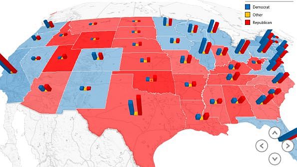
In some situations, you might want to add more visualizations (i.e., layers) to a map. This can be done within the Layer Pane. At the top of the Layer Pane, click the Layer Manager icon (which looks like three stacked sheets of paper), then click the + icon to add a new layer. (Alternatively, you can select the Add Layer option on the Power Map ribbon.) You then go through the same process of selecting a geography mapping and choosing a visualization type. The map in Figure 6, which is available in the sample workbook Chessman_PowerMap_Example2_Elections.xlsx, has a second layer depicting state electoral votes as a bubble visualization.

Figure 6: Adding a Second Layer Depicting State Electoral Votes as a Bubble Visualization
Note that you don't have to choose the same mapping for each visualization. For example, you can create an initial layer to display a region visualization by state or province, then create another layer with geocode coordinates to display a column visualization.
Adding a Date Attribute to a Mapping Visualization
With Power Map, you can add a date attribute to a layer in order to show how a map changes over time. To see this in action, open up the Excel workbook Chessman_PowerMap_Example2_Elections.xlsx. On the Insert tab of the ribbon, click the Map button. In the Launch Power Map dialog box that appears, click the Example 2 tour. In the second scene, Elections Over Time, which Figure 7 shows, I added the Date column to the TIME list box in both layers. If you click the Play button located at the bottom of the scene, you'll see the map change from election to election.

Figure 7: Adding a Date Attribute to Show How the Map Changes from Election to Election
Playing and Sharing a Tour
After one or more layers have been added to a scene and one or more scenes have been added to a tour, the tour can be played. Similar to PowerPoint in presentation mode, Power Map will transition from one scene to the next in full-screen display. Note that on the Layer Pane, you can set each scene's duration (along with a few other effects) in the Scene Options section.
To share a tour with other people, you can simply share the Excel workbook. (Each tour is saved as part of the Excel workbook.) Alternatively, Power Map can generate an .mp4 video of any tour. To create a video, click the Create Video option from the Power Map ribbon. Here's a video of the Example 2 tour:
Add a "Wow" Factor to Your Presentations
Power Map is an interesting new addition to Microsoft's BI self-service suite of products. With 3D maps and animation capabilities, it adds a "wow" factor to any presentation. I encourage you to work through the sample workbooks I provided, then try Power Map with your own data.
Read more about:
MicrosoftAbout the Author
You May Also Like


.jpg?width=700&auto=webp&quality=80&disable=upscale)
