A look at the new Outlook Mail app in Windows 10 Mobile (Build 10051)A look at the new Outlook Mail app in Windows 10 Mobile (Build 10051)
Microsoft has done away with the previous design language Windows Phone used. There are no more pivots and carousel-style visuals. Now there is a more traditional design.
April 14, 2015

When Microsoft released the newest build of Windows 10 Mobile Technical Preview last Friday, there were a few new apps included with the new build. One of the new apps was the redesigned Outlook Mail app.
When Microsoft first announced Windows 10 and the convergence between all devices, they announced there would be a new Outlook Mail app that would be universal. With Windows 10 Mobile build 10051, we get a first look at how that app will work with phones. Let’s take a look at the app.
Note: Microsoft has done away with the previous design language Windows Phone used. There are no more pivots and carousel-style visuals. Now there is a more traditional design.
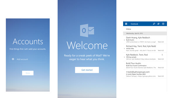
Upon first opening the app, you will be prompted with a rather beautiful, aesthetic looking, Welcome screen. As you proceed, clicking on the Get started icon will take you to the Account screen where you will see the email account you have on your phone (if you updated from WP8.1) or in my case, a screen to add an account. Once you open up an account, you are taken to the newly designed Inbox. The new Outlook app brings all of your email accounts into one place, similar to what the desktop Outlook mail client has been doing. This is of course different than the current “link inboxes” function we have in Windows Phone 8.1.
From the inbox, you will see the “highly criticized” hamburger menu, which appears to be here to stay. Clicking on the menu brings you to a panel which lists all your accounts, allowing you to view the different email folders for each account. Also, at the bottom of this panel you will see a calendar icon which takes you to the new Outlook calendar app, a smiley face which allows you to give feedback to Microsoft, and the settings gear icon. At the top right of the app you have three icons: search, refresh, and the “plus” icon allowing you to compose a new email. While in the inbox view, swiping left on an email allows you to quickly delete it and swiping right on it allows you to set a flag on the email. Your emails are separated by a thin grey line for each email and a thicker grey bar which includes the day of the emails. This really makes it easy on the eyes for those of you are like me and have tons of emails.
When in composition mode for a new email, you will see the standard ellipses icon at the bottom. You will also see three new icons: attachments, delete, and send. Upon opening up the ellipses you are then prompted with the various new formatting options for the email. Formatting options such as: font selection, lists, highlight, bold, and so. All the options you would see in the desktop Outlook client of old.
From testing out the new Outlook Mail app, this build has everything you would expect from a mail application. We have yet to run into a major issues with form and function. Actually, it was a rather simple process to send emails, imagine that.
Check out the gallery for the Outlook Mail app in Windows 10 Mobile (Build 10051).
About the Author
You May Also Like


.jpg?width=700&auto=webp&quality=80&disable=upscale)
