The Universal Windows Platform and App ScalingThe Universal Windows Platform and App Scaling
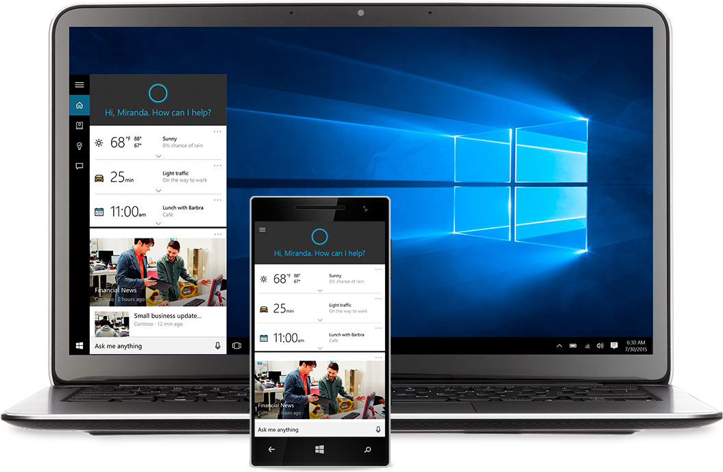
The Universal Windows Platform provides a framework for app developers to deliver their app to any platform running Windows 10 and making sure that apps UI works on screens of all sizes is critical.

Microsoft has invested a lot of time and effort into their Universal Windows Platform (UWP) tools to help developers target not only Windows 10 on mobile devices but on PCs, tablets and large devices like Surface Hub, HoloLens and very soon Xbox One.
While the concept of developing for one device and targeting multiple end points for your app is a great time saver it does require some work on your part as a developer to make sure the user interface and user experience of your app work for each possible screen size.
That is where scaling comes into play and can make or break your app across those different screen sizes.
They say when people are eating they begin with their eyes and software/apps are just like that. The look of an app is a very important aspect of your work and will many times will make the difference between someone immediately closing the app or starting to use it.
Of course, Microsoft understands this as well so they can share from their own experience in developing first party apps for Windows 10 devices and their latest blog post aims to help you with the scaling your app needs.
It covers scaling your app across multiple types of apps and user interface features such as app tabs, app bars, nav panes, reflowing app data and detail pages.
"Sometimes also referred to as responsive design, adaptive design is a set of practices that enables an app’s UI to resize and restructure itself when the display screen changes its size, orientation, or aspect ratio. When a UWP app runs in desktop mode on Windows 10, adaptive design also comes into play when users resize the app window.
Windows 10 uses an algorithm to scale fonts and other UI elements for each device. Instead of actual pixels, the scaling algorithm takes effective pixels into account in order to make sure that your fonts look good on a Surface Hub at a standard 10-foot distance as well as on a mobile device at a typical 5-inch distance from your face."
To learn more about these adaptive design practices for your app you can read the entire article from Microsoft. I also recommend keeping an eye on the Windows Developer site for other tips and tricks for building your apps.
But, wait...there's probably more so be sure to follow me on Twitter and Google+.
----------
Looking for an awesome, no-nonsense technical conference for IT Pros, Devs, and Devops? Check out IT/Dev Connections!

Read more about:
MicrosoftAbout the Author
You May Also Like
.jpg?width=100&auto=webp&quality=80&disable=upscale)
.jpg?width=400&auto=webp&quality=80&disable=upscale)


.jpg?width=700&auto=webp&quality=80&disable=upscale)
