SharePoint How-To Series: Business Intelligence Power Pivot and ChartsSharePoint How-To Series: Business Intelligence Power Pivot and Charts
In the last post, we focused on Excel Services and some basic functions it can perform for presenting spreadsheet data into SharePoint. Excel as a tool is great for manipulating data and creating the types of charts that you would like to see on a dashboard. In the last few versions of Excel, new features have been added such as PowerPivot and Power View. These allow greater control and features for evaluating data and then consuming it within SharePoint.
December 11, 2015

In the last post, we focused on Excel Services and some basic functions it can perform for presenting spreadsheet data into SharePoint. Excel as a tool is great for manipulating data and creating the types of charts that you would like to see on a dashboard. In the last few versions of Excel, new features have been added such as PowerPivot and Power View. These allow greater control and features for evaluating data and then consuming it within SharePoint.
Within Excel choosing the “Data” tab allows us to select the “Manage Data Model” tool. Once loaded it should look like this.
If we choose the “Get External Data”, we can select from various sources. For our example we will choose to load a spreadsheet, all though we could connect to any number of data sources.
We need to scroll down to the “Text Files” option and choose the “Excel File” option and then add our file.
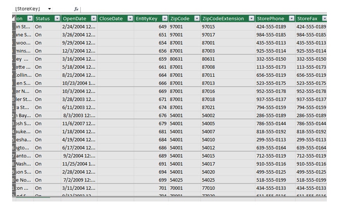
Once the spreadsheet is loaded, we will then select the “Stores” tab or any other range we have created.
Once selected it should complete and our data is loaded and should display just like it does in a regular spreadsheet view.
From the core navigation if we now select the “Pivot Table” option we are able to choose different options depending on what we wish to create.
For our demonstration we will choose the simple “PivotTable” option first. This will then load a regular Excel design canvas but present some options that are specific to the “Pivot Table” approach.
The right hand pane allows you to navigate the data, then drag and drop the fields into four containers. These four containers allow you to structure the data as you need. We will add the following:
Now we have the settings made our data should now look something like this.
Using the “ZipCode” filter our results can be dynamically changed for specific zip codes. Now we some data structured we could also repeat the same process but this time select the “Pivot Chart” option instead.
The same editing experience is used for creating the charts too. We select the fields from the data and add them to the containers as before but this time charts are rendered. Once we have this set we should not have an interactive chart of some description, for my demonstration I used a simple bar chart.
Now comes the fun part we save our spreadsheet and then upload to SharePoint as we did before. Once we have saved it, we can simply open the spreadsheet and we should see the same kind of structure and features as we did in the native Excel client.
Now to complete our use of this, if we go back to our page that has the Excel Web Access web part on the page, we can now change this to point to this new spreadsheet and render just the chart.
As you can see this brings a great new dimension to presenting data within SharePoint. Using the great client side tools for generation of the data, lists, tables and charts means that you don’t need to be a Business Intelligence wizard to create something useful.
In the next post we will delve deeper into other features that SharePoint supports for consuming and presenting data.
About the Author
You May Also Like


.jpg?width=700&auto=webp&quality=80&disable=upscale)
