Surface Tip: Make the Desktop More Touch-FriendlySurface Tip: Make the Desktop More Touch-Friendly
The desktop doesn't have to be a painful experience for Surface users
November 26, 2012

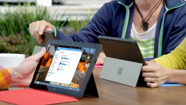
While moving between the Metro environment and the desktop can be a bit jarring on any PC, the Surface’s small screen and relatively low resolution makes the desktop even harder to use. But you don’t need to suffer: A couple of simple configuration changes will make the desktop environment more touch-friendly.
The issue here is simple enough: While the Start screen and other Metro experiences were designed for multi-touch, the desktop was not. And in File Explorer and other areas, there are onscreen items that are simply too small to easy select with a finger.
While the desktop will never be truly ideal for touch, it can certainly be made to work better. And if you’re interacting with Surface primarily via touch, I have a few suggestions for making it so.
First, tap and hold on a blank area of the desktop and choose Personalize from the menu that appears. (Yes, it will be a bit tough this first time.) In the Personalization control panel that appears, tap the Display link in the lower left corner of the window. This brings up the Display control panel.
Both of the major functional areas here are useful to Surface owners.
In the top area, change the size of all items from Smaller to Medium (125 percent). Click Apply and sign out so the change can take effect. When you sign back in and return to the desktop, you can see the difference this one change makes, and even those tiny entries in the File Explorer navigation pane are easier to tap now.
Return to the Display control panel to examine the rest of this interface. In the bottom part of the window, you can increase the size of controls in Windows that include text—title bars, menus, message boxes, palette titles, icons, and tooltips—and do so on a control-by-control basis. I recommend bumping the size of the text of each item to at least 11 points for a more touch-friendly interface. (Some controls will already be this size.)
Another useful configuration change is to make sure that all File Explorer, Control Panel, and desktop applications display full-screen and not in windowed mode.
There are two reasons for this change. One, it will help in application switching as you move between Metro-style experiences, which are pretty much always full-screen, and desktop applications and windows. And two, physically rotating the Surface display causes onscreen elements to rotate as well, and floating desktop windows are often resized in unhelpful ways during rotation. By keeping these windows full-screen, rotation will no longer ruin your window sizes or positions.
Do you have any other tips or suggestions for making the desktop more touch-friendly? Let me know!
About the Author
You May Also Like


.jpg?width=700&auto=webp&quality=80&disable=upscale)
