Hands-On with Windows 8.1: Mail
Microsoft gets it right this time
August 14, 2013

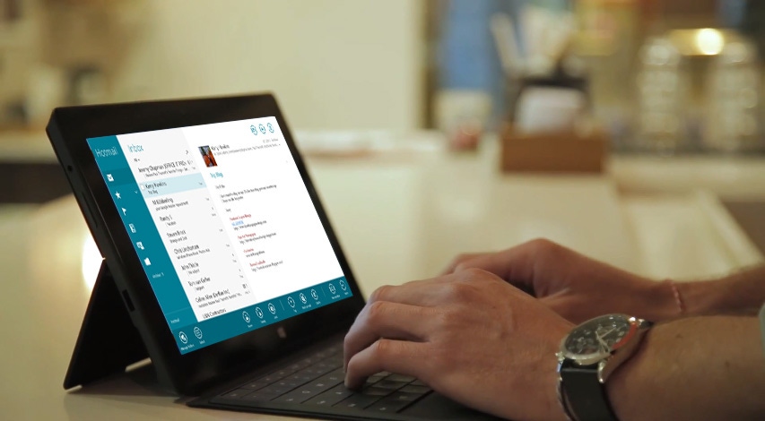
In Windows 8.1, the bundled Mail app gets truly useful with new drag and drop and folder pinning capabilities, compatibility with key Outlook.com features such as Sweep, newsletter filtering and social network integration, and a newly discoverable and more useful user interface.
This is a major update, as expected. But there is one obvious feature that is still missing: A unified inbox view. And given the direction this app has taken, I’m wondering now whether that will ever happen. More on that in a bit. But first, some of the new stuff I’ve noticed.
Refreshed UI
The new Mail app has received a refreshed user interface, and while I appreciate the strange combination of its simpler look and its more advanced functionality, I wish there was a way to configure the Folders column, as I’ll call it for now, to use a textual view rather than just big ol’ Fisher Price icons. Some of them just aren’t obvious.
That said, there are some nice UI changes too. The app bar, previously hidden and undiscoverable, is now called out a mini app bar at the bottom that looks/works similarly to that control in Windows Phone (though it’s opaque here and not transparent). When you tap anywhere on this mini app bar (and not just on the ellipsis as in Windows Phone), you get the full app bar, and you can of course use the previously established methods for displaying this control as well. Sadly, there’s no way to “pin” it open, as one may want in a productivity app.
The UI in general, and app bar in particular, do a good job of adapting to different screen resolutions and window sizes. So for example if you snap two windows or apps side-by-side, the app bar will provide a customized layout and drop the button labels to save space.
Drag and drop
As promised and expected, the new Mail app supports drag and drop of messages between the columns in the app, and it works with both keyboard and mouse. So you can do things like drag a message onto the Flag icon to mark it as flagged. Or you can drag it into a folder to move it to a new location. This is one of the main features that kept me from using Mail previously, and I’m wondering now if I’ll be using this app more regularly as a result.
Folder pinning
When you drag a message to the All folders icon in the Folders view, a new pane expands so that you can choose which folder to use. But you can also tap that icon to open the pane then “star” (why not “pin”? Too consistent?) a folder and pin it to the Folders view for easier access. Pinned folders appear below the list of icons and are inconsistently identified by a textual name.
Open mail in a new window
There’s a new button in the app bar called New Window that opens the currently displayed message in a new window snapped next to the main Mail window.
If you’re familiar with Microsoft email applications, you may mistakenly believe that this functionality is a toggle and that each time you select a message in the Messages column on the left, it will display in the snapped window to the right. But that’s not how it works. Instead, the new window is treated like another app window, and the point of this view is so that you can view two email messages (or more likely, an email message and a reply) side-by-side.
Outlook.com features
The new Mail app really comes alive when you use it with an Outlook.com (including Hotmail) account. You see additional icons in the Folders column, including Newsletters, which uses Outlook.com’s automatic newsletter filtering capabilities to populate its message list, and Social updates, a special folder that displays updates your contacts have posted to Facebook and other networks. And in the app bar, you’ll find a Sweep button that integrates with the Sweep feature in the Outlook.com service. The view for Exchange and Office 365 (business) accounts are decidedly drag by comparison.
Best of all, it also supports Outlook.com aliases. More on this on a moment.
Unified inbox?
That set of Outlook.com integration pieces makes me wonder whether Mail will ever support a unified inbox view as we see in the Windows Phone Mail app. That, plus the always-visible Folders column, which is different for each account, would lead to some busy and distracting redrawing each time you selected a message from a different account in the Messages column. I think it makes a unified inbox impractical if not impossible.
I can live without it, and of course many will prefer to keep their different accounts separate anyway, or consolidate email up in the cloud. What makes that latter option all the more viable would be if Microsoft’s email clients, including this one, would respect the “send mail as” functionality that users configured in Outlook.com or Office 365. It doesn’t do that. But what it does do is support Outlook.com aliases. So you can send mail from an alias easily enough, and if you wish, you can even set that as the default.
Overall, this is a major update and one that I think addresses most of the key complaints about the original Mail app. The big question is whether I could use this app in lieu of my current web-based apps, and it’s pretty clear that this could work nicely. A Metro app I actually use regularly? Look out for the flying pigs.
About the Author
You May Also Like


.jpg?width=700&auto=webp&quality=80&disable=upscale)
