How To: Switching to the Dark Theme in Microsoft Office 2016How To: Switching to the Dark Theme in Microsoft Office 2016
There's a new theme in town. Office 2016 offers a Dark Gray theme that can help alleviate eyestrain.
September 30, 2015

Dark UI themes seem to be all the rage these days. Whenever Microsoft releases the option for an app, the blogosphere goes a bit crazy. Take for example, the recent update to the Mail and Calendar app that now offers the dark theme as an option. The update also brings the Windows 10 Mail app much closer in look and feel to regular Outlook, don’t you agree?
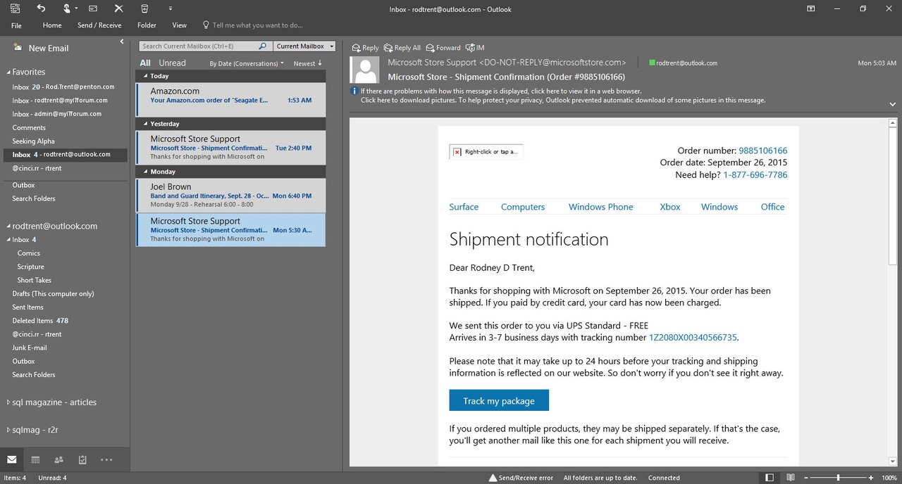
But, did you know that Outlook 2016 already provides a dark theme? The theme is actually named “Dark Gray,” but it provides the same effect. And, of note, when you change the theme in any Office 2016 app, it changes it across all Office 2016 apps at once. For this example, I'll use the options in Microsoft Outlook since I have that app open all day long.
To switch to it:
In Microsoft Outlook 2016, go to File – Options.
On the General page, change the Office Theme to Dark Gray.
The change is immediate once you hit the OK button. Here’s a preview of what it will look like…
It may take a bit to become accustomed to, but the Dark Gray theme can be easier on the eyes and actually cause less eyestrain.
Read more about:
MicrosoftAbout the Author
You May Also Like


.jpg?width=700&auto=webp&quality=80&disable=upscale)
