Windows Phone 8.1 Tip: Manage the Navigation Bar, Part 2Windows Phone 8.1 Tip: Manage the Navigation Bar, Part 2
It works differently with different screens
September 1, 2014

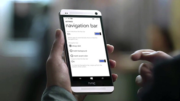
I bet you didn't think there was much more to say on this topic. But with the release of the HTC One M8 for Windows, we see a new Windows Phone 8.1 behavior that wasn't available previously: As it turns out, that new navigation bar, with its software-based Back, Start and Search buttons works differently depending on the type of display used. Let's take a look.
If you're not familiar with the new navigation bar in Windows Phone 8.1, please do read Windows Phone 8.1 Tip: Manage the Navigation Bar first. Long story short, Microsoft is now allowing its hardware makers to re-utilize Android handset designs for Windows Phone, and one of the ways it has enabled this is by letting them use a software-based navigation bar. To date, the few Windows Phone handsets that utilize this design have been low-end devices like the Nokia Lumia 630 and 635, which feature low-res screens with non-standard resolutions (like the 854 x 480 screen on the 630/5 vs. a more typical normal 800 x 480 resolution).
But the HTC One M8 is a flagship device with a normal 1080p HD screen. So its use of a navigation bar, instead of physical buttons, is notable.
It's also unique, for now at least, in that it is the first Windows Phone handset to take advantage of navigation bar features that make the most sense on a high resolution HD screen, though I don't see why it couldn't be used on lower-res screen devices as well.
With lower-end devices, at least those with non-standard resolutions, the navigation bar is always on and you can choose between three display styles:
Always dark. In this case, the background of the navigation bar will always be dark (black).
Match background. Here, the background of the navigation bar will match your theme's background color (which is set in Settings, System, Start + Theme). If you use a dark background, the nav bar's background will be black. If you use a light background, the nav bar's background will be light gray (and not white as you might expect).
Match accent color. With this option, the nav bar background will match your theme's accent color (also set in Settings, System, Start + Theme).
That's literally all you can do to configure this feature. On the HTC One M8, which has a 1080p HD display, however, we see two additional options:
Auto hide/show the navigation bar. When set to On, apps can choose whether the navigation bar is displayed when that app is running. I'm not currently aware of any apps that do this, but presumably this will become more common going forward.
Swipe to hide the navigation bar. When set to On, you can swipe up from the bottom of the screen to hide (or show) the navigation bar. When set to Off, you can still hide (or show the navigation) bar, but you do so via a new caret button on the left side of the nav bar. (That caret does not appear when this option is set to On.)
That latter option is of course the most interesting, and for a couple of reasons.
On high-res displays, it's now possible to dedicate every pixel on the screen to whatever app or experience you're using. With previous nav bar implementations, the nav bar was always on screen, and unless you were using a game, those pixels were unusable for anything but navigation.
On Windows Phone handsets in which that latter feature is implemented, the nav bar can always be hidden. The only difference is how you do it. This is a big change for Windows Phone, which had always provided discoverable navigation via on-device buttons before this release. There are some semi-annoying pop-ups that warn you about the hidden nav bar, but for the most part this feature assumes some familiarity with the system.
Clearly, the real reason Microsoft is allowing this change is so that Android device makers can offer a 1:1 transition from an existing Android design to Windows Phone. That is, with a low-end device like the 630, Nokia/Microsoft is offering a non-standard screen resolution so that the nav bar can remain onscreen and not impact the usable onscreen real estate (800 x 480) in that case. With a device like the M8, the screen is 1080p, so an always-on nav bar would steal away from onscreen pixels that would normally be available.
What's most interesting about this feature, perhaps, is how quickly you get used to it. My expectation is that future Windows Phone flagship devices from other Windows Phone hardware makers, like Nokia/Microsoft, will utilize normal 1080p HD displays and use a software-based navigation bar. You really do get used to this edge swipe behavior quickly.
About the Author
You May Also Like


.jpg?width=700&auto=webp&quality=80&disable=upscale)
