
While PowerShell is typically thought of as a text-based environment, you can build full-blown GUI applications within it. Additionally, you can use the data visualization capabilities of Microsoft .NET to construct graphs and charts.
Before diving into this topic, there are two points to bear in mind.
First, charts can be quite complex. There are more than 30 different types of charts that you can create, as well as countless options for incorporating multiple data series and various visual elements. In this article, however, I am going to discuss the most basic charting capabilities, focusing instead on the process of building a chart with data retrieved from a SQL Server database.
Second, before continuing on, I highly recommend learning about using PowerShell to access SQL Server data. I recently wrote an article on the topic: How To Connect to SQL Server Database From PowerShell.
Skip ahead to the sample Powershell script.
Putting SQL Server Data Into PowerShell
So, with all that said, the very first step is to read the data from SQL and then put that data into a format that PowerShell can visualize.
Here are the lines of code that perform this task:
$Data = Invoke-SQLCmd -ServerInstance Win11SQL\SQLEXPRESS -Database MyAppDB -Query “Select Month, ItemsSold From Table1”

$DataSource1= [ordered]@{}
ForEach($Item in $Data){
$CurrentMonth = $Item.Month
$CurrentItem = $Item.ItemsSold
$DataSource1.Add($CurrentMonth, $CurrentItem)
}
The first line of the code initiates a query on a SQL Server database named MyAppDB and returns data from the Table1’s Month and ItemsSold columns. The previously mentioned article explains the logistics involved in executing SQL Server queries through PowerShell.
The data that is returned by the SQL query is stored as a PowerShell object in a variable named Data. However, the data visualization code requires the data to be stored in a hash table. A hash table is essentially a list that contains a series of key / value pairs.
The hash table is created with this line of code:
$DataSource1=[ordered]@{}
This command creates an empty hash table named DataSource1. An important thing to note is the inclusion of the word “Ordered.” If you don’t include the [Ordered] statement, the bars within the chart will display in random order, rather than in the same order as they appear.
The next bit of code sets up a ForEach loop. This loop takes the items stored in the $Data variable and adds them to the hash table as key / value pairs.
Once this task is completed, we can proceed to create the chart.
The Basic Elements of a Chart
A chart is placed on top of what is known as a form. You can think of a form as a canvas for Windows GUI elements, such as buttons and text boxes, all of which can be created using PowerShell.
Beyond the form, three high-level elements make up a chart: the chart object, chart area, and data series.
Chart object
At the lowest level, we have the chart object. The chart object is essentially just a named object to which all the various components of the chart are attached. To see what I mean, take a look at the code below:
$Form = New-Object Windows.Forms.Form
$Form.Text = "Sales"
$Form.Width = 800
$Form.Height = 800
$Form.controls.add($Chart1)
$Form.Add_Shown({$Form.Activate()})
$Form.ShowDialog()
This code segment appears at the end of the script, which you will see shortly. Here’s a breakdown of the code:
- The first line of code creates a Forms object, which is essentially an empty window.
- The next line adds the word “Sales” to the top of the window. Note that this label isn’t technically part of the chart.
- Next, the code defines the form’s width and height dimensions for the chart.
- We then add a chart object to the form. I mentioned that a chart object is a named object, and I have named the chart object $Chart1.
- The last two lines activate and display the form.
Note that the code excerpt appears at the end of the script because other elements must be defined before displaying the form.
Note also that this code excerpt only adds the chart to the form. It does not define the chart. That task is handled elsewhere in the script.
Here is a code excerpt related to the chart object:
$chart1 = New-object System.Windows.Forms.DataVisualization.Charting.Chart
$chart1.Width = 700
$chart1.Height = 700
$chart1.BackColor = [System.Drawing.Color]::White
In this section of the code, we are creating a named object called $Chart1. This excerpt also defines the chart’s width, height, and background color. Note that while the previous code excerpt defined the width and height of the form itself, this excerpt defines those attributes of the chart.
A single form can contain multiple charts. Even if you intend to create a single chart, the form must be large enough to properly display the chart within it.
Chart area
The second chart element is the Chart Area. The Chart Area is also a named object and defines all the attributes related to the chart.
Here is a code excerpt related to the Chart Area:
$chartarea = New-Object System.Windows.Forms.DataVisualization.Charting.ChartArea
$chartarea.Name = "ChartArea1"
$chartarea.AxisY.Interval = 10
$chartarea.AxisX.Interval = 1
$chart1.ChartAreas.Add($chartarea)
As you can see in the above code, the Chart Area is a named object. In this case, I am simply calling it ChartArea1. Here, the Chart Area only serves to define the X and Y axis intervals. However, you can create any number of other objects to connect to the Chart Area.
Data series
The third element to know is the data series. I have already touched on the data series a bit. The data series is essentially the data that will be plotted on the chart. The data series is named, and you can associate various attributes with it, such as the chart colors or the chart area.
Here is a code excerpt related to the data series, which in this case is called Sales:
[void] $chart1.Series.Add("Sales")
$chart1.Series["Sales"].chartarea = "ChartArea1"
$chart1.Series["Sales"].color = "Blue"
$Chart1.Series["Sales"].Points.DataBindXY($DataSource1.keys, $DataSource1.values)
The important thing to understand about the data series is that a chart can include multiple data series. For example, if you wanted to plot both sales data and data related to returns, you would create two separate data series – one for sales and another for returns.
Sample Script
So, now that we have covered the basic elements that make up the chart, here is what the script looks like in its entirety:
$Data = Invoke-SQLCmd -ServerInstance Win11SQL\SQLEXPRESS -Database MyAppDB -Query “Select Month, ItemsSold From Table1”

$DataSource1= [ordered]@{}
ForEach($Item in $Data){
$CurrentMonth = $Item.Month
$CurrentItem = $Item.ItemsSold
$DataSource1.Add($CurrentMonth, $CurrentItem)
}

# Load the appropriate assemblies

[void][Reflection.Assembly]::LoadWithPartialName("System.Windows.Forms.DataVisualization")

# chart object

$chart1 = New-object System.Windows.Forms.DataVisualization.Charting.Chart
$chart1.Width = 700
$chart1.Height = 700
$chart1.BackColor = [System.Drawing.Color]::White

# Chart area

$chartarea = New-Object System.Windows.Forms.DataVisualization.Charting.ChartArea
$chartarea.Name = "ChartArea1"
$chartarea.AxisY.Interval = 10
$chartarea.AxisX.Interval = 1
$chart1.ChartAreas.Add($chartarea)

# Data Series 1 - The series is called Sales
[void] $chart1.Series.Add("Sales")
$chart1.Series["Sales"].chartarea = "ChartArea1"
$chart1.Series["Sales"].color = "Blue"
$Chart1.Series["Sales"].Points.DataBindXY($DataSource1.keys, $DataSource1.values)

# Display the chart on a form

$Form = New-Object Windows.Forms.Form
$Form.Text = "Sales"
$Form.Width = 800
$Form.Height = 800
$Form.controls.add($Chart1)
$Form.Add_Shown({$Form.Activate()})
$Form.ShowDialog()
When you execute the script, it produces the chart that is shown in Figure 1. As previously noted, you can create charts that are far more elaborate and fancier. For this article, I wanted to keep the chart as simple as I could to facilitate an easier learning process.
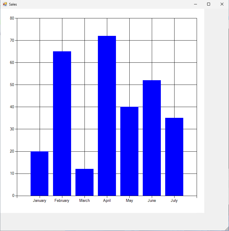
Figure 1. This is the chart that was produced by my script.
About the author
 Brien Posey is a bestselling technology author, speaker, and 21x Microsoft MVP. In addition to his ongoing work in IT, Posey has trained as a commercial astronaut candidate in preparation to fly on a mission to study polar mesospheric clouds from space.em>


